Responsive Design Bookmarklet
Recently I heard about this Responsive Design Bookmarklet in Brett Terpstra’s podcast Systematic #37 and I since then I used it a lot.
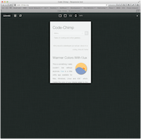
When you click it, it basically adds a little header to the currently open page, which shows you the dimensions of your browser window and let’s you simulate screen sizes of an iPad and iPhone.1 The only downside is that it still uses the old iPhone screen size, which isn’t really a problem in portrait orientation but can be a bit misleading in landscape orientation.
Since doing responsive design can be a bit of a bother, this bookmarklet made it a lot easier on me.
portrait and landscape orientation ↩︎